SUPER Easy logo design contest!

  • Status: Closed
  • Prize: $30
  • Entries Received: 8
  • Winner: cowboyrg

Contest Brief

This contest i so easy it's almost not worth posting!

We already have the concept for a logo established.
All we need is for an expert like you to refine it, make it look awesome and deliver!

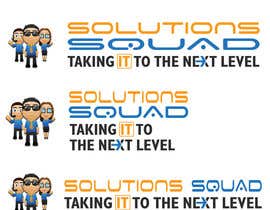
The attached png shows 4 different types we'd like the logo to be presented.
The font used is called Space Age.

We are looking for you to adjust the sizing and aspect of the text, icon and people in the icon for best presentation in each logo "type".

Apply changes to the tag line including:
Make the IT pop and stand out.
Implement an arrow between the E and X in next.

While we are open to new ideas, we are looking to mainly stay with the above concept.

The colors to use are:
Orange #ff9b0c
Blue: #2c74bc


The maximum budget for this contest is $30.

A payment will only be made once your final delivery has been accepted to our liking, at which point 50% will be paid, followed by 50% on source delivery.

Please feel free to contact us with any questions and happy designing!

Recommended Skills

Employer Feedback

“Absolutely phenomenal! Patient, talented, caring, and.. no language barrier.”

Profile image beachcompcom, United States.

Public Clarification Board

  • beachcompcom
    Contest Holder
    • 9 years ago

    Folks, were coming to a close! Get your last entries in please!!! ALSO AS A NOTE, ONCE THE CONTEST WINNER IS SELECTED, WE STILL EXPECT YOU MAKE CHANGES UNTIL WE COME TO A FINAL ACCEPTANCE.

    • 9 years ago
    1. mwa260387
      mwa260387
      • 9 years ago

      please wait 2 hours...

      • 9 years ago
  • cowboyrg
    cowboyrg
    • 9 years ago

    Uploaded yesterday a revised version.

    • 9 years ago
  • beachcompcom
    Contest Holder
    • 9 years ago

    Also, we'd like solutions and squad to be the same size as they are eqully part of the company name.

    • 9 years ago
    1. mwa260387
      mwa260387
      • 9 years ago

      wait..

      • 9 years ago
  • beachcompcom
    Contest Holder
    • 9 years ago

    Folks, the idea here is NOT to do a complete redesign of the logo, but to polish the look that has already been provided, and present the polished look in the multiple formats as shown in the brief. PLEASE pay close attention to the brief, and design in accordance.

    • 9 years ago
  • mwa260387
    mwa260387
    • 9 years ago

    wait

    • 9 years ago
  • GiaCat
    GiaCat
    • 9 years ago

    #66 and #67 with little different in arrow.

    • 9 years ago
  • GiaCat
    GiaCat
    • 9 years ago

    Can i change the text font?

    • 9 years ago
  • thechiefgamer9
    thechiefgamer9
    • 9 years ago

    #63

    • 9 years ago
  • sanaakram161
    sanaakram161
    • 9 years ago

    please check my submitti0n entry 23

    • 9 years ago
  • beachcompcom
    Contest Holder
    • 9 years ago

    Please see attached 154885_473229001374_1154124_n.jpg for the concept on the arrow.

    • 9 years ago
  • LampangITPlus
    LampangITPlus
    • 9 years ago

    mean to redesign and I can adjust move text and picture ?

    • 9 years ago
  • ricklaurence
    ricklaurence
    • 9 years ago

    see entry #18

    • 9 years ago
  • ricklaurence
    ricklaurence
    • 9 years ago

    please check entry #16 and #17.. thanks

    • 9 years ago
  • beachcompcom
    Contest Holder
    • 9 years ago

    Maybe a stretch, but is it possible to incorporate a computer screen, mouse or something PC related behind the IT without distracting from the rest of the logo?

    • 9 years ago
    1. creativeart08
      creativeart08
      • 9 years ago

      kindly rate #14

      • 9 years ago
  • beachcompcom
    Contest Holder
    • 9 years ago

    We are also looking for you to improve how the 3 people blend with the overall lgo, including how far away they are from each other, and shadows.

    • 9 years ago
  • beachcompcom
    Contest Holder
    • 9 years ago

    The 4 logos are essentially the same, but with different presentations and sizes.

    • 9 years ago
  • HouttiDev
    HouttiDev
    • 9 years ago

    I can't see any different between the first and second logo ?

    • 9 years ago

Show more comments

How to get started with contests

  • Post your contest

    Post Your Contest Quick and easy

  • Get tons of entries

    Get Tons of Entries From around the world

  • Award the best entry

    Award the best entry Download the files - Easy!

Post a Contest Now or Join us Today!