New Awesome "CrossFit style" gym needs a pumped up LOGO!
- Status: Closed
- Prize: $116
- Entries Received: 76
- Winner: nibfreelancer

Contest Brief
*****UPDATE*****
This logo contest has been extended. Please continue to format your submission according to the attached layout. Thank you. We are close to choosing a winner.
*******************
*****UPDATE*****
You must read the contest description and format your submission according to the attached layout. Thank you. Please only use the layout as a guide, we still want your unique design and unique format.
*******************
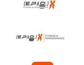
This is a logo design contest for a new "CrossFit style" gym called (E.P.I.Q.) X
You are designing a logo that says: (E.P.I.Q.) X Fitness and Performance
The color palate is: Neon Orange/Slate Gray/ Dark Gray
You will include the parenthesis and the superscripted letter X with the words 'Fitness and Performance' included somewhere in your design either as a subscript tagline or some other place. The prominent feature of the design should be the (E.P.I.Q.)X logo styling. (E.P.I.Q.)X is an abbreviation for ENHANCED PERFORMANCE IMPROVED QUALITY to the eXponential degree. Hence the parenthesis with the mathematical formula look. We are open to unique graphical elements, mascots, unique lettering, or designer interpretation.
We want to see your logo design in 3 layouts. All proper submissions will include all three variations. Please put all three layout variations on the same image. 1) A horizontal layout (suitable for a website header, banner, or logo). 2) A vertical, condensed layout (suitable for a business card, letter head, or printed signage). 3) A icon layout (suitable for an app icon, program icon, or website button). All entries desiring to win will include your logo in these three layouts. The layouts can have variation from one style to another. We are very open to designer interpretation.
The winning designer will hand over all rights (copy, trademark, and service mark) to us and stop all use of the design. The winning designer will also agree not to replicate the same design for another client. The winning designer will include the following final files for the handover: Your ORIGINAL layer files (either Illustrator, Photoshop, or other), Each layout in a 5000 px JPEG (on white bg), PNG (with the alpha channel removed for transparency).
Good luck, have fun, and let's get creative with this one guys and gals!
Recommended Skills
Employer Feedback
“Perfection! Thanks so much!”
![]() VidageLLC, United States.
VidageLLC, United States.
Public Clarification Board
-

nazrulislam277
- 7 years ago
Please check entry #180
- 7 years ago
-

mj956
- 7 years ago
#164
- 7 years ago
-

lalibadin
- 7 years ago
Please see the designs #159 , #155 , #154 and provide your feedback . I will be glad to make any changes if desired.
- 7 years ago
-

Contest Holder - 7 years ago
***CONTEST EXTENDED***HI everyone. Thank you for all of your fantastic designs. We've extended the contest to ensure our goals are met. We will be contacting the leading designers via PM for adaptations. Be patient as the Holiday Season is here in American and will slow the pace of this contest over the next several days. Thank you so much!
- 7 years ago
-

mighty999
- 7 years ago
please check #147
- 7 years ago
-

skavoijit
- 7 years ago
Kindly check entry #141,#144,#143, Thanks.
- 7 years ago
-

logofair
- 7 years ago
- 7 years ago
-

DavidBoyati
- 7 years ago
Please check #131, #132, I think you will like ti. thank you.
- 7 years ago
-
DavidBoyati
- 7 years ago
Please check #129, #130, thank you.
- 7 years ago
-

kulsumaktar11
- 7 years ago
PLEASE CHECK #125#126
- 7 years ago
-
Contest Holder - 7 years ago
Hi Everyone, Thank you all for your wonderful submissions. The designs are looking great. Keep the kettle bell designs coming in. Also, we wondered what the (E.P.I.Q.)X design would look like in this font? http://www.dafont.com/forum/attach/orig/7/2/72724.jpg any takers?
- 7 years ago
-

tieuhoangthanh
- 7 years ago
Please check #121 . Thank you !
- 7 years ago
-

Rahulldp
- 7 years ago
sir Would you Please Give Me The font Name ? Font Link... Than I Can Try ....... The Font Link Is NotAvailable To Me...
- 7 years ago
-
Contest Holder - 7 years ago
Would love some designs to try this or similar font: http://www.dafont.com/forum/attach/orig/7/2/72724.jpg
- 7 years ago
-

jisuvo7
- 7 years ago
Please check Entry #95 .It's maintained all of your formula .Thank you .
- 7 years ago
-
Contest Holder - 7 years ago
Thank you for following the contest entry submission guidelines.
- 7 years ago
-

JIzone
- 7 years ago
please check#87#88#89#90#91
- 7 years ago
-

ronjames1928
- 7 years ago
- 7 years ago
-

dkdesign8449
- 7 years ago
Please check #82 #83 #84 #85 thanks
- 7 years ago
-
skavoijit
- 7 years ago
Please check sir entry #79 give feedback and rating, Thanks.
- 7 years ago
-
Contest Holder - 7 years ago
Love the kettle bell designs coming in! Nice job! Love to see more of those. Thank you all for your fantastic submissions! Please always remember to follow contest description guidelines thank you http://data.freelancer.com/contest/909462/2016-VDG-LogoContestLayout.jpg
- 7 years ago
-
Contest Holder - 7 years ago
Kettle bells anyone? Any designer want to try to incorporate kettle bells within their design? Maybe in place of the periods. I wonder how that would look?
- 7 years ago
-
bujarluboci
- 7 years ago
please check this site and have a look at your entries that are rated with 4 stars http://www.gtgraphics.org/genericlogos.html
- 7 years ago
-
Contest Holder - 7 years ago
thanks for the information.
- 7 years ago
-
ronjames1928
- 7 years ago
- 7 years ago
-

CreateUniqueDSGN
- 7 years ago
please check #51 ...Thanks.
- 7 years ago
-
Contest Holder - 7 years ago
Thank you all for your wonderful submissions. PLEASE REMEMBER TO follow this guide for your submissions thank you. This is only a guide for how your final submission should include the three layouts we asked for. All unique images to showcase your design should go below the submission guide. Please be unique with your design, the guide is there to help you layout your submission, not give you style advice. We want uniqueness! Thanks! http://data.freelancer.com/contest/909462/2016-VDG-LogoContestLayout.jpg
- 7 years ago
-
Contest Holder - 7 years ago
****UPDATE***** Please follow this guide for your submissions thank you. This is only a guide for how your final submission should include the three layouts we asked for. All unique images to showcase your design should go below the submission guide. Please be unique with your design, the guide is there to help you layout your submission, not give you style advice. We want uniqueness! Thanks! http://data.freelancer.com/contest/909462/2016-VDG-LogoContestLayout.jpg
- 7 years ago
-
bujarluboci
- 7 years ago
please be unique with your design??!?!!? do you know what is the most overused font in the world? please check this site and have a look at your entries that are rated with 4 stars http://www.gtgraphics.org/genericlogos.html
- 7 years ago
-

jamesmilner25
- 7 years ago
hi sir i would like to formally apologize for the miss spelling of EPIQX from my first post please review my revisions of the design #45
- 7 years ago
-

alishahsyed
- 7 years ago
please check and rate #26
- 7 years ago
-
Contest Holder - 7 years ago
Hi All, Thank you for your submissions and keep them coming. PLEASE remember to read the contest description brief. Entries that don't follow the three layout format will be rejected, no matter what they look like. Thank you!
- 7 years ago
-

Future designs
- 7 years ago
- 7 years ago
-
Future designs
- 7 years ago
Please check #12
- 7 years ago
How to get started with contests
-

Post Your Contest Quick and easy
-

Get Tons of Entries From around the world
-

Award the best entry Download the files - Easy!