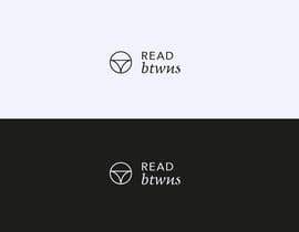
Logo For Big Brand

  • Status: Closed
  • Prize: $150
  • Entries Received: 1
  • Winner: Rodryguez

Contest Brief

We are looking for talented freelancers. Design a logo for our brand.
READ BETWEENS.
Your mission is to create a major asset - the logo. Open to incorporating ideas around the quote "read between the lines" . But all ideas welcome. Visual creativity and clever use of colours/fonts. We are keeping the brief very loose just show us your best logo for a clothing brand targeting intellectual, savvy woman with a good sense of humor. Comments on the entries will offer more direction. Please show how logo will work
1) alone.
2) on a clothing label and
3) On a small package that would fit a pair of socks (product is not socks.
Winner to Please UPLOAD:
An EPS file, or Encapsulated PostScript file, jpg and gif, tiff, Full Color, Black and Reversed Logos, Favicon / iPhone / iPad icons
More work for the winner.

Recommended Skills

Employer Feedback

“Really went above and beyond. And we love the style. Fast turnaround. ”

Profile image katytaly, United States.

Top entries from this contest

View More Entries

Public Clarification Board

  • Rodryguez
    Rodryguez
    • 6 years ago

    Many people in this platform copy the best design, please, seal the contest to upload our designs without being seen by other freelancers, you will get better designs. #sealed

    • 6 years ago
    1. Centenario3851
      Centenario3851
      • 6 years ago

      You are right......

      • 6 years ago
    2. corradoenlaweb
      corradoenlaweb
      • 6 years ago

      they are all crazy JAJAJAJA

      • 6 years ago
  • Creativenuts
    Creativenuts
    • 6 years ago

    #extended

    • 6 years ago
  • saba71722
    saba71722
    • 6 years ago

    please check #765 #766 #767 #768 #769

    • 6 years ago
  • sojib8184
    sojib8184
    • 6 years ago

    #758

    • 6 years ago
  • usualdesign176
    usualdesign176
    • 6 years ago

    new name read btwns?

    • 6 years ago
  • katytaly
    Contest Holder
    • 6 years ago

    We cannot say betweens. try with Read Btwns

    • 6 years ago
  • katytaly
    Contest Holder
    • 6 years ago

    *** BRIEF CHANGE***

    • 6 years ago
  • katytaly
    Contest Holder
    • 6 years ago

    Most of you have gone with an RB option. try some without

    • 6 years ago
    1. Rodryguez
      Rodryguez
      • 6 years ago

      #sealed

      • 6 years ago
    2. artsign
      artsign
      • 6 years ago

      please check #603

      • 6 years ago
  • aymangigo
    aymangigo
    • 6 years ago

    Please take a look at my entry #564

    • 6 years ago
  • DesignExplorer
    DesignExplorer
    • 6 years ago

    Please check #354

    • 6 years ago
  • katytaly
    Contest Holder
    • 6 years ago

    some fantastic entries here folks. we are loving the simplicity and ideation.

    • 6 years ago
    1. artsign
      artsign
      • 6 years ago

      simple clever and meaningful #234

      • 6 years ago
  • Nazgraphic
    Nazgraphic
    • 6 years ago

    #229 Please check

    • 6 years ago
  • Freadeiya
    Freadeiya
    • 6 years ago

    please check

    • 6 years ago
  • santarakhi8
    santarakhi8
    • 6 years ago

    please check #181#183#184#185 Entry.

    • 6 years ago
  • DimitrisTzen
    DimitrisTzen
    • 6 years ago

    Check please entry #178

    • 6 years ago
  • lench
    lench
    • 6 years ago

    #sealed

    • 6 years ago
  • sheeraz5
    sheeraz5
    • 6 years ago

    please check #129

    • 6 years ago
  • sojib8184
    sojib8184
    • 6 years ago

    #122

    • 6 years ago
  • zwarriorx69
    zwarriorx69
    • 6 years ago

    Avoid variations of is called the split logo format where the stalks of alphabets are used to break the name into parts , either as speech bubbles or as normal as these are all too common in innumerable contests. Case in point
    https://www.freelancer.com/contest/Design-a-Logo-for-an-App-Marketing-Agency-1193006.html
    https://www.freelancer.com/contest/Logo-Design-High-res-and-multiple-formats-1184455.html

    • 6 years ago
    1. zwarriorx69
      zwarriorx69
      • 6 years ago

      nd Just FYI ... you should go through these links to understand how some freelancers operate. cos u might get something similar to these as well or variations of the same, happens almost everytime ... http://www.gtgraphics.org/genericlogos.html
      http://www.gtdesigns.it/overusedlogos/
      https://www.crowdspring.com/blog/logo-design-branding-mistake-generic/

      • 6 years ago
  • katytaly
    Contest Holder
    • 6 years ago

    Stay away from reds. bold colours. logo needs to work small

    • 6 years ago

Show more comments

How to get started with contests

  • Post your contest

    Post Your Contest Quick and easy

  • Get tons of entries

    Get Tons of Entries From around the world

  • Award the best entry

    Award the best entry Download the files - Easy!

Post a Contest Now or Join us Today!