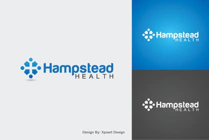
Logo Design for Hampstead Health
- Status: Closed
- Prize: $290
- Entries Received: 86
- Winner: dhukka88

Contest Brief
Hampstead Health is the umbrella organisation which provides integrated multidisciplinary healthcare services to the patients living in the surrounding (suburban) community. The healthcare services available within the two-storey Hampstead Health facility
Recommended Skills
Employer Feedback
“Great logo which we are very happy with. Logo had multiple levels which reflected our organisation. Would hire again.”
![]() n11ck, Australia.
n11ck, Australia.
Public Clarification Board
-

Contest Holder - 11 years ago
Thank you all for you submissions. We have selected #65 as the winner.
- 11 years ago
-

MARIOadvertising
- 11 years ago
#128 feedback please!
- 11 years ago
-

dirak696
- 11 years ago
please check http://k32.kn3.net/D702EC9E3.jpg ;)
- 11 years ago
-

mihaimiroslav
- 11 years ago
Please rate #132 . Thank you!
- 11 years ago
-

taganherbord
- 11 years ago
Please check #130 .Thanks
- 11 years ago
-

sohals091
- 11 years ago
please check my entries and also please give feedback
- 11 years ago
-

pachomoya
- 11 years ago
Please feedback #104 #103 #102 #101
- 11 years ago
-

badcom
- 11 years ago
Sorry my entries, seem to the vision is bigger than the view large option when you preview. Not sure why but if you click on the entries the right view comes up...#99 and #100. I tried to fix the way it is shown but not luck.
- 11 years ago
-

xahe36vw
- 11 years ago
I hope you like my design, #93 #94 because this is more characteristic of a hospital that modern, clean, professional and friendly.. Regars - Hexa :)
- 11 years ago
-
xahe36vw
- 11 years ago
Hi...Please check this one #93 #94 I think this is more specific and more assertive. Thanks - Hexa :)
- 11 years ago
-

Dilyana23
- 11 years ago
Please any comments about #80 and #81 :) Thank you!
- 11 years ago
-
iadesign
- 11 years ago
#76
- 11 years ago
-
Raselbhuiya
- 11 years ago
please say something about my entery ****60
- 11 years ago
-

dhukka88
- 11 years ago
Please check #63, #64, #65, #66 and Give me feedback about the work please.
- 11 years ago
-

DejanLalatovic
- 11 years ago
#42 feedback please
- 11 years ago
-
dhukka88
- 11 years ago
Please check #63, #64, #65, #66 and Give me feedback about the work please.
- 11 years ago
-
xahe36vw
- 11 years ago
- 11 years ago
-
xahe36vw
- 11 years ago
Thanks for your responses were very helpful to me... Regard :)
- 11 years ago
-
xahe36vw
- 11 years ago
Hi sir, please look at this one #57
- 11 years ago
-
xahe36vw
- 11 years ago
Hi.. let's see this one #53 and #55 Thanks :)
- 11 years ago
-
xahe36vw
- 11 years ago
#56 it's to you.. Thanks :)
- 11 years ago
-

sirrom
- 11 years ago
please check #54 a revision. thanks - sirrom
- 11 years ago
-
Contest Holder - 11 years ago
#11 - Friendly and welcoming typeface, colouring has a nice contrast. Logo reflects synergy & integration, however it looks separated and looks more like a fitness or gym logo. Logo needs reworking and the shade of green feels a little distant.
- 11 years ago
-

salunkeswagat
- 11 years ago
Check #2
- 11 years ago
-
Contest Holder - 11 years ago
The icon is too overpowering and washes out the brand name. The brand name needs to be more distinctive and have a more interesting typeface.
- 11 years ago
-

rahulanand94
- 11 years ago
Hi again!!!Uploaded another entry.Please check out #3 , #4 and give your valuable feedback about further changes!!
Thank You- 11 years ago
-
Raselbhuiya
- 11 years ago
MY DESIGNS ARE 21 AND 22....PLEASE IF ANY CHANGE NEED KINDLY INFORM ME...
- 11 years ago
-
xahe36vw
- 11 years ago
Hi .., we would appreciate if you could give us an assessment to this job.., Thanks :)
- 11 years ago
-
Contest Holder - 11 years ago
#16 has a modern and professional colouring and typeface. Good colour use of contrast to set 'Health' as the focal point. Logo reflects integration however it suggests a cardiac/heart related business, which is inaccurate.
#17 - The logo is too busy, there is too much going on and it looks too generic. Perhaps it can be simplified a little, while still looking distinctive.- 11 years ago
-
dhukka88
- 11 years ago
Please check #43 and Give me feedback about the work please.
- 11 years ago
-
Contest Holder - 11 years ago
A bit too simple. Nice typeface but the icon looks like paperclips
- 11 years ago
-
Contest Holder - 11 years ago
The typeface is clean, friendly and professional. The logo is good in terms of how it reflects the concept of integration, however it does not stand out enough. It would not support brand recognition. I think reworking the cross in the a slightly more unique way would work well.
- 11 years ago
-
dhukka88
- 11 years ago
Please check #45, #46, #47, #48 and Give me feedback about the work please.
- 11 years ago
View 1 more message
-
Contest Holder - 11 years ago
The leaf on #47 suggests natural remedy, instead of clinical. This may not be appropriate
- 11 years ago
-
Contest Holder - 11 years ago
#46 has a clean and simple design, perhaps the word "Health" would look better with left or right alignment. Also, the word "Hampstead" might look better in a solid colour, rather than the gradient which fades at the top. The Typeface is also too stern and rigid.
- 11 years ago
-
sirrom
- 11 years ago
please check #44 . thanks - sirrom
- 11 years ago
-
Contest Holder - 11 years ago
Nice, clean design. One issue is, while the typeface is good, it is very formal and institutional, not warm and friendly enough. Maybe you could try a slightly different typeface treatment for the word 'Health', perhaps use a typeface which is rounder, but yet would complement the other typeface. The icon is good, conveying the idea of integration of multiple personnel.
- 11 years ago
-
sirrom
- 11 years ago
Hi, thanks for your response. will work on a revision and upload when completed. thanks - sirrom
- 11 years ago
-
xahe36vw
- 11 years ago
Hi.., #16 #17 it's to you... Thanks :)
- 11 years ago
-
Contest Holder - 11 years ago
The icons suggest a cardiac (heart) centre, which is inaccurate.
- 11 years ago
-
dhukka88
- 11 years ago
Please check #15 and Give me feedback about the work please.
- 11 years ago
-
rahulanand94
- 11 years ago
Hello sir.Designed a logo as per your requirements.please check out #3
- 11 years ago
-
yancydionne
- 11 years ago
#1 , please give feedback and say what I can change for you...
- 11 years ago
How to get started with contests
-

Post Your Contest Quick and easy
-

Get Tons of Entries From around the world
-

Award the best entry Download the files - Easy!