improving our Logo
- Status: Closed
- Prize: $30
- Entries Received: 16
- Winner: carethv26

Contest Brief
We are doing some changes to our logo. There are things we want to keep of our logo and things we would like to change.
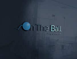
General aspect: we are looking for a clear neat design, logo is for a company that delivers workshops to executive managers, need to look professional. Name of company: On The Ball
What we like of our logo and don't want to change:
The font and font size
the fact the O T and B are capital letters
the italics in the tagline
What we would like to be done differently:
-the BOUNCING next to the letter O is perceived as an additional letter, the letter W. people are reading "won The Ball" instead of "On The Ball". The bouncing is to be eliminated or redesigned. We would recommend to submit one logo with an alternative bouncing and another logo without the bouncing
- the LETTER O, we would like to have it as bright blue solid, like that in the attachment 2, but capitol letter
please find attached our current logo, in attachment 2 an example on how we would like the O and in attachment 3 a paper draft of what the new logo should look like. We were also thinking to change the " " in the tagline with ... , but feel free to no use any antil winner is finalised, this is not really relevant.
Thanks
Recommended Skills
Employer Feedback
“Simply perfect, time, commitment, skills. We hired him again immediately”
![]() fcoffari, Australia.
fcoffari, Australia.
Public Clarification Board
How to get started with contests
-

Post Your Contest Quick and easy
-

Get Tons of Entries From around the world
-

Award the best entry Download the files - Easy!