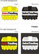
Freelancer: morizu
Share:
Report Entry

improved design

i've notice that the lower side of water tank image is a little bit ackward, i've make some improvement on that area, and additional monochromatic version.

Contest Entry #171 for                                                 Design a Logo for saba trading

Public Clarification Board

  • alalawis
    Contest Holder
    • 10 years ago

    hello
    my client need to try :
    make the tank close after remove the name
    need to work on the name on /or the tank
    he need some idea like smile or an eye

    some image to get the idea:
    http://www.suck.uk.com/HTMLContent/images/EdibleEyes_logo.png
    http://jemmajmclean.files.wordpress.com/2013/03/argos_new_logo.jpg
    http://hative.com/wp-content/uploads/2013/05/letter-e-logo-design-ienjoy.png
    http://www.stevenheld.com/graphic-design-portfolio/portfolioNew/logos/unique_logo.png

    • 10 years ago
    1. morizu
      morizu
      • 10 years ago

      btw, kindly advice colour combination desired

      • 10 years ago
    2. alalawis
      Contest Holder
      • 10 years ago

      i think the best way is make the tank close and add the name under or beside it and make the eye or smile in the name not the tank as for color the color you choose first is ok for know when we finish the logo we can see if the color needs to be changed

      • 10 years ago