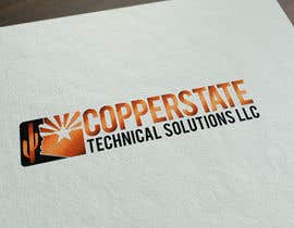
Design a logo for electrical/mechanical maintenance equipment business.
- Status: Closed
- Prize: $150
- Entries Received: 308
- Winner: FutureArtFactory

Contest Brief
Design a business logo following the attached logo design plan (please read carefully). The logo will be used on the website and business cards to create a professional business image that will increase sales.
All contestants should attempt to submit an entry with the following logo concept and one or more original concepts:
Image of state of Arizona in United States with the company name and slogan over it.
- State in copper color.
- Outline around state with contrasting color that looks nice: sea green, turquoise, black, rusty red, dark green, gold.
Please submit as many variations of this concept as you like. We are looking for graphics quality, font quality, and color coordination quality.
You are welcome to submit original concepts as well but there is an 80% probability the customer will choose a variation of the above concept so be sure to work on that first.
Recommended Skills
Employer Feedback
“Logo design showed a lot of creativity and incorporated all the elements we were looking for. Freelancer is great to work with. Makes changes quickly with a positive attitude. Highly recommended!!!”
![]() prattsystems, United States.
prattsystems, United States.
Public Clarification Board
-
Contest Holder - 8 years ago
Thank you very much for your entries. You are all winners for trying and doing your best!!! It has been a great contest. After careful consideration we’ve selected a winner. Please don’t take it personally if you weren’t selected. Your design style may not have been the best match for our logo but may work well for another company so believe in yourself and keep developing your skills and competing.
- 8 years ago
-

gustavosaffo
- 8 years ago
Thank you.
- 8 years ago
-
Contest Holder - 8 years ago
Less than one week left and no clear winner. Please think outside the box and submit some new original concepts.
- 8 years ago
-
Contest Holder - 8 years ago
Great job everyone!!! Keep working on the suggested changes for your entries and submit original concepts. We have over a week to go and there is no clear winner yet.
- 8 years ago
-
atomixvw
- 8 years ago
CH i have been to a project:
https://www.freelancer.com/contest/Design-a-Logo-263207.html?fast_login=1#
this one, look what logo win and look at #235, this is insain, is the same logo... CHECK IT!- 8 years ago
View 4 more messages
-
Contest Holder - 8 years ago
The graphic images you mentioned are similar but different enoug for #235 to be reasonably original.
- 8 years ago
-
Contest Holder - 8 years ago
Don't spend too much time or energy worrying about similarities. Unless you find a copyright violation your time is better spend on the suggested changes for your entry.
- 8 years ago
-
atomixvw
- 8 years ago
CH why you accept copy logos?
http://www.clipshrine.com/Arizona-flag-2392-medium.html- 8 years ago
-

maramaar
- 8 years ago
Hello and thank you very much for invitation! I am working on design:)
- 8 years ago
-

creativeoncall
- 8 years ago
Is it necessary to submit 8 versions of the same logo?
- 8 years ago
-
Contest Holder - 8 years ago
No, some designers submitted different versions with different fonts. One entry per concept is fine.
- 8 years ago
-
Contest Holder - 8 years ago
We really like the mountain/cactus image used by flowkai in #56 : https://www.freelancer.com/contest/Design-a-logo-for-electricalmechanical-maintenance-equipment-business-261721-by-flowkai-14846053.html but unfortunately this is a copyright violation. Please try to make a version with an original mountain/cactus image that looks similar to this.
- 8 years ago
-
Contest Holder - 8 years ago
Please use a copper color that looks like copper, not brown. Do a Google image search for copper or copper color to see examples of what color copper is.
- 8 years ago
-
Contest Holder - 8 years ago
Please make your entry original and don't copy other entries or existing logos.
- 8 years ago
-
Contest Holder - 8 years ago
We are putting them at a lower rating and will not choose them. We like the idea and designers can draw from the concepts and create original works.
- 8 years ago
-
Contest Holder - 8 years ago
Copyright infringement occurs when your new work incorporates artistic expression from the original, even if it takes only a small part of the original work, and even if you add a lot of your own original expression. For example, if the second illustrator rendered the same figure in the same pose, removing the same hat, even if his illustration has a different background. There is a famous quote from Judge Learned Hand that goes “no plagiarist can excuse the wrong by showing how much of his work he did not pirate.”
https://graphicartistsguild.org/tools_resources/trademark-copyright-and-related-legalities- 8 years ago
-
atomixvw
- 8 years ago
Flowkai #102 is the same like those
http://www.sports-logos-screensavers.com/ArizonaWildcats.html
changing colour is not changing logo design....- 8 years ago
-
Contest Holder - 8 years ago
Yes, you are right. We are putting these copied entries at a lower rating and will not choose them. We like the idea and designers can draw from the concepts and create original works.
- 8 years ago
-
Contest Holder - 8 years ago
Copyright infringement occurs when your new work incorporates artistic expression from the original, even if it takes only a small part of the original work, and even if you add a lot of your own original expression. For example, if the second illustrator rendered the same figure in the same pose, removing the same hat, even if his illustration has a different background. There is a famous quote from Judge Learned Hand that goes “no plagiarist can excuse the wrong by showing how much of his work he did not pirate.”
https://graphicartistsguild.org/tools_resources/trademark-copyright-and-related-legalities- 8 years ago
-

flowkai
- 8 years ago
Thank you for informing me did not know what such a design already used may have taken the same photos and I. I change my option. Sorry but it's a coincidence that I'm correct. Thank you all for your understanding.
- 8 years ago
-

IulMil
- 8 years ago
This " flowkai " guy will make Arizona Wildcats really angry for stealing their logo: http://www.sports-logos-screensavers.com/ArizonaWildcats.html
- 8 years ago
-
Contest Holder - 8 years ago
We are receiving some very good entries and looking forward to more contest entries!
Please use a copper color that looks like copper, not brown. Do a Google image search for copper or copper color to see examples of what color copper is.- 8 years ago
-
Contest Holder - 8 years ago
The font is very important for this logo since it is a big part of how it will look. We are open to different fonts and would like to see your entry with several different options. The winning entry will have a great font.
Our font preferences include:
- Clear, clean, and easy to read
- Modern but not to the extent of being science fiction modern
- We may even consider a western font- 8 years ago
-
Contest Holder - 8 years ago
Please make the font and layout polished and professional.
- 8 years ago
-
Contest Holder - 8 years ago
Entry notes:
- Like colors in entry #4 , nice contrasting colors that work well.
- Copper color is very good in entries #15 and 6. Please avoid brown and orange which are not copper color.
- Like font in entry #11 , very readable
- Like cactus and mountains in entry #21
- Like Arizona flag in entry #5- 8 years ago
-
Contest Holder - 8 years ago
Don’t want words in a circle around the state. This is difficult to read.
- 8 years ago
-
Contest Holder - 8 years ago
Please make font size same for whole name: Copperstate Technical Solutions, LLC Please don’t make the font larger for the word Copperstate
- 8 years ago
-
Contest Holder - 8 years ago
There was a mistake in the cstsolutionsllc.com logo design plan document: Copperstate is one word and not two. I’m sorry for the error.
- 8 years ago
How to get started with contests
-

Post Your Contest Quick and easy
-

Get Tons of Entries From around the world
-

Award the best entry Download the files - Easy!