Kinkoi10101
Philippines

LOGO ONLY!! (PLEASE DO NOT SEND EFFECTS AND DIFFERENT BACKGROUNDS)
We are looking for a creative person to make a company logo. Name of our company is "RightHouse." We are looking for someone to think outside the box.
Please do not submit any logos of a check mark with a house :).
Our company is for home buyers and home sellers come to us to find the right Real Estate Agent. We connect buyers and sellers with Real Estate agents. We are looking a full set of logos for branding a company.
WHAT WE NEED:
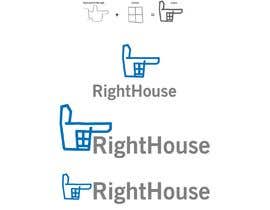
1) Logo with the Word "RightHouse"
2) Small square Logo (Icon only, no text)
3) Just the word "RightHouse".
PLEASE NOTE THE WORD RIGHTHOUSE IS ONE WORD!!!!!
“Very professional. Responded quickly and made all requested changes.”
![]() righthouseadmin, Canada.
righthouseadmin, Canada.
Congratulation, Evarist.
thank you so much
So.... CONTEST HOLDER, have you come to a decision?
Hi Contest Holder, Kindly check all the remaining unrated entries (my #898 & #899 ). Thanks and have great day...
Hi Contest Holder, Kindly check all the remaining unrated entries (my #898 & #899 ). Thanks and have great day...
please check #785
Hello sir, please check my all entry's #1047 #1048 #1049 #1050 #1056 #1057
Hello sir, please check my all entry's and that is my concept. #1039 #1041 #1042 #1043 #1046
Please check #1058
#1038 #1044. Please check this.
Dear contest holder Please check the entry #1007 #1016
Please kindly check #992,999,1006,1013 .
Your feedback is highly appreciated!
please provide feedback.

please check #981
#983 DON'T OVER-THINK! Simple is ALWAYS better. (less is more) I'm sticking to my initial concept, presented here in black and white. Thank you for your consideration.
Dear contest holder #957 #951 #946
Thank you
don't miss the creative entries!
#909 #910 #912 #915 #916
#928 #932 #933 #934 #937
Hey guys,
We appreciate all the enterie so far. We’re still reviewing the ones we like.
We have created a list of some of the concepts we like from the logo’s we’ve seen so far, we would love to see more creative ideas that incorporate these ideas. We’re looking for a modern logo that will look nice on a site and inside of mobile apps. Do not feel constrained by this list, rather use it for inspiration.
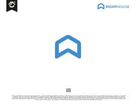
- Hexagon shape.
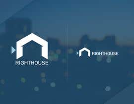
- A Lighthouse.
- Simple cartoon house with rounded edges.
- Rounded chat icon.
- The letters RH.
- Abstract minimalistic shapes.
Note: We would also love to see your logos’ incorporate the color #3e8dd3. Feel free to use other colors as well.
Thanks,
The RightHouse team

I've made 2 concepts based on the above information you provided. Please take a look #922 #924.
Pardon the space b/w words. I've updated that in new entry #930.
Check my concepts at #769 #771
Thanks!
#908 #907
Sir Please Check #885
Hi sir
please feedback #782 & #881 & #882
hello sir! kindly check my entry...#744
please check #60 #75
sir please check all my new entry #849 #850 #851 #854 #856
Please check #844
feedback #782
Hey everyone,
We have looked through your submissions and have noticed a few ideas that we like:
- Messaging/chat icon incorporated
- Connections between people
- Concept of a house
- A visual distinction between "Right" and "House"
- Clean, professional fonts
Things we don't like:
- Checkmarks
- Busy logos
- Just text
Please also just send us your basic logos on white backgrounds, instead of any fancy rendering.
Please keep "RightHouse" as a single word.
Thanks,
The RightHouse team
#171 please
check #664
PLEASE CHECK #785 , #786
please take a look at #817. I hope you like it. Regards.
Sir,please check #696 #697 #699 #702 #804 #805 #806 #807 & feedback
Dear contest holder check my entry #780 #779 #777 #776 #775 #774
#792
PLEASE CHECK #785 , #786
please check #785
Please feedback for #781 , #783 Thanks.
feedback please #778
rate or reject please i am still waiting
#756, #757 Thanks :)
check #750 #752 #754
sir! kindly check my entry...#744 thank you
please check 727&728number entry
Please check #719
Hi,
check update on #706 #707 #708 and #709 entries
Thanks
#691 is a B&W / Grayscale version of #683. Thanks in advance for your feedback!
#683 is a REVISED version with TYPE refining and a few color treatments. Happy to make changes until you are 100% satisfied. I look forward to your feedback and the opportunity to work together. Creatively and professionally yours, - Brian

Post Your Contest Quick and easy

Get Tons of Entries From around the world

Award the best entry Download the files - Easy!