Need an infographic
- Status: Closed
- Prize: $250
- Entries Received: 13
- Winner: GerpLtd

Contest Brief
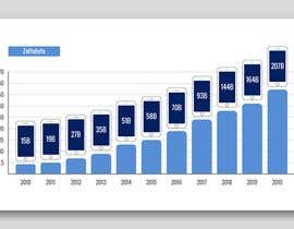
I want an infographic based on the attached data (datasphere.xlsx). The spreadsheet shows the size of the global datasphere (the amount of data that exists in the world) from 2010 to 2020. The way to read the spreadsheet is this: in 2010 the datasphere was 4 zettabytes, or 15 billion iPhones (256GB model). In 2011 the datasphere was 5 zettabytes or 19 billion iPhones, etc. This image will go into an article I'm writing and I'm using the iPhone analogy to make the idea of how much data there is more accessible to readers.
For this project I'm looking for an interesting way to show this data. Some version of a chart or graph is fine, but open to other ideas as well. The final image should be a .png or .jpg, no wider than 1000px, and have a white background. I would also like a scalable PDF as part of the final delivery.
Recommended Skills
Employer Feedback
“Second project I did with Albena. She's great! Professional, responsive, and willing to accommodate my picky changes. :) Highly recommend. ”
![]() justdowhatworks, United States.
justdowhatworks, United States.
Public Clarification Board

How to get started with contests
-

Post Your Contest Quick and easy
-

Get Tons of Entries From around the world
-

Award the best entry Download the files - Easy!