rhyme665
Bangladesh


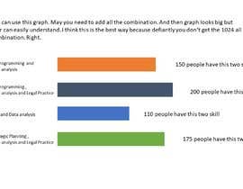
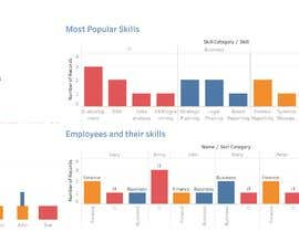
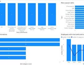
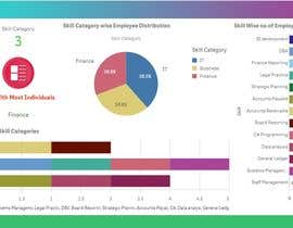
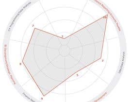
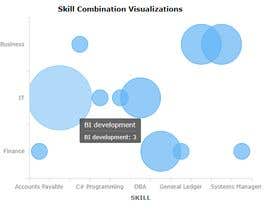
We are looking for someone who can provide several simple effective visualisations of data for a website. We have a database of approximately 10,000 individuals, together with a list of skills that each of them have (based on a skill list), grouped by a skill category (E.g. IT, Business, Finance, Management etc. Some people may only have one skill within one category, whilst others may have 10 skills across different categories (having more skills is not necessary better as fewer skills can potentially mean a higher quality of that skill). With a lot of people in our database it is difficult for us to see the bigger picture of how many people have the different combinations of skills and across the different categories, so we are looking for several concept visualisations of how we might show this to the user so they can easily understand the numbers that exist within the different combinations of skills, and across the different categories. Providing the user with several different visualisations may be necessary or beneficial.
Note; We are looking for visualisations of the counts of the different combinations, not tabular lists or reports of the individual individuals.


Post Your Contest Quick and easy

Get Tons of Entries From around the world

Award the best entry Download the files - Easy!