Design an App's Chat Screen
- Status: Closed
- Prize: $100
- Entries Received: 25
- Winner: SOSDisenyo

Contest Brief
So we need to redesign this screen to look like iOS 10-11 ish style.
As you see this screen looks pretty OLD'ish
what we want is new iOS style design
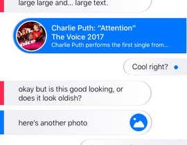
*Please see the attached screenshot of what it looks right now*
Notes: Images, VIdeos are only shown when the buttons are tapped.
**iOS style doesn't mean copy iMessage****
Some Suggestions i go from big UI Designers
remove shadows and borders first.
Padding looks off.
Colors are too undefined.
Color if orange needed, currently isn't orange.
Use better Contrasts.
--------
The rectangular link preview sitting on top of the blue card doesn't look good. The two elements need to be integrated better, IMO.
-------
smaller containers, less border radius, consistent margins please!! Remove the oranges and go for light gray maybe. Better spacing between cards also ! I think if you fix these issues you'll get an approval, if you're looking for a visual similar to iOS. Also a lighter font would be great!
-------
make BIG paddings, give design more AIR.
and DELETE all stylisation of bubbles e.g. SHADOWS, OUTLINES and STROKE
Recommended Skills
Employer Feedback
“he gave us a really good UI and good new concept”
![]() bhizita, India.
bhizita, India.
Public Clarification Board

How to get started with contests
-

Post Your Contest Quick and easy
-

Get Tons of Entries From around the world
-

Award the best entry Download the files - Easy!