Freelancer: rachelrek
Share:
Report Entry

Template

I've included both with a picture and without, which gives you flexibility with your design. The fonts are basic and clear, so it is easy to read. The 'a' doesn't look like an 'o' and the simplistic design keeps the attention on the material and not the background. Let me know if you would like any changes.
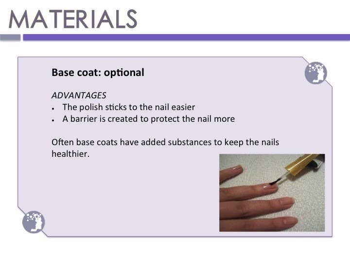
Contest Entry #10 for                                                 Design a PowerPoint template

Public Clarification Board

  • Obilisa
    Contest Holder
    • 9 years ago

    You asked me a question so I will reply here. What I like from the MsPetrova one is that it is a bit more playful than yours. Yours is quite straight forward. For example I like the balls in hers (including the one with the logo.

    • 9 years ago
  • rachelrek
    rachelrek
    • 9 years ago

    I used purple instead of pink to keep it more gender neutral!

    • 9 years ago